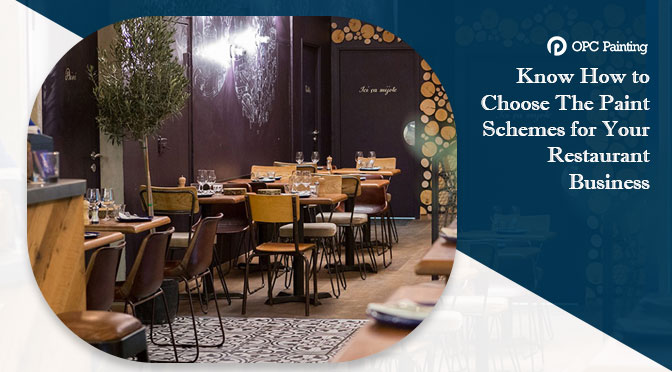
It’s just not about the aesthetics that matter while deciding the colour and ambience of the restaurant interior. According to the studies, the restaurant interior colour can greatly impact the psychology of the customers. It’s a great way to influence the customers and let them subconsciously react in many ways- starting from food choices to the amount of money they spend to enjoy the facilities and offers.
For example, the use of warmer tones at the entrance of the restaurant makes the customer feel that the temperature around is quite high than outside. On the other hand, cooler shades a psychological impulse that makes people think than the temperature is more relaxed. Find how different colours can impact your customers with our painting services in Sydney–
Light Colours: If you have a restaurant with limited space, our commercial painting company in Sydney can paint the interior walls with light colours to make your restaurant look bigger. Colours like beige, white and light grey provide a relaxing feel among the customers, making them feel more welcomed. Being in pace with your creative sense, you can paint one wall with light one and opposite one with bright colour. Even painting the restaurant ceiling with light colour can make the place look more spacious.
You can use potted plants on minimal red seating to create a fantastic effect with white floors. The aim is not to generate one specific emotion, but to create a range to gain the maximum benefit.
Purple and Blue: No matter how unbelievable it sounds- the colour blue and purple are associated with toxins that help to decrease the appetite of customers. Even the blue or purple food items are considered to limit the appetite that a person has. So, why not call our painting services in Castle Hill to get such hues to your restaurant business.
Bright Shades of Red and Yellow: Yellow and red are most widely used colours, those are not only comfortable to see but also elevate the heart rate and blood pressure of the customers to create exciting emotions, which makes them eat quickly and leave. So, you will find these colours in most of the fast-food restaurants.
Our expert painters in Balmain say the main influential factors to choose the colour scheme for fast food restaurant are based on the brand logo and colour as well. And, such colour schemes are only advised to apply across the places, which have high-footfalls and instigate customers to leave fast.
Warmer Shades Of Brown, Red and Orange: Such warm colours let people relax, whereas dark tones of red, maroon, and warm orange and brown boost the appetite of the customers and goes best for a multi-cuisine restaurant.
Lastly, when choosing the interior restaurant colours, you have to consider the type of restaurant you run and kind of food you serve. For example, If it’s a new restaurant, it’s better to redecorate your establishment, and painting your walls as per the type is a good idea. Besides, lighting and wall hanging will be a great business booster. Also, be aware of how the colours on your menu interact and make sure they don’t clash with each other. For example, you can’t use a lot of bright colours on your menu, if your interior is using a lot of earthy tones like dark green or brown.